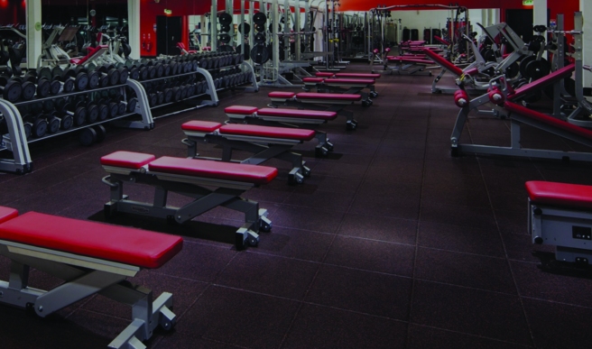
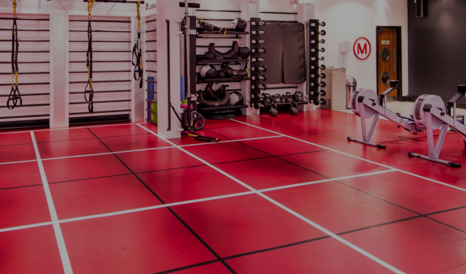
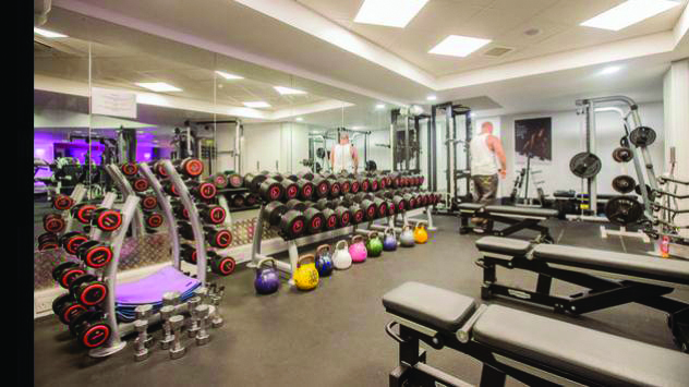
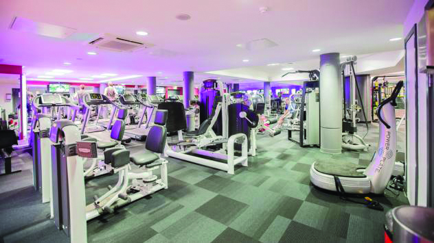
From my research it was made clear that there is little correlation from the apps and systems used in gyms and the layout and design of the gyms they are used in. Below are images of gyms that I have both been to with the one at the bottom two being the one I currently have a membership at and attend frequently. The problem I have with them is that they are quite difficult to navigate in the terms of wayfinding. Everything is everywhere, looks the same colour and there isn’t signage that tells you where to go for what exercise, the only major signage in both environments is to indicate studios and changing rooms. It is a case of trial and error and looking to find what you want. I think this in itself could be quite daunting to new members and people who are trying to become acquainted with the gym. I believe that my idea of using colour to indicate muscle groups could be converted to a signage or a wayfinding system that helps navigate members around the gym.
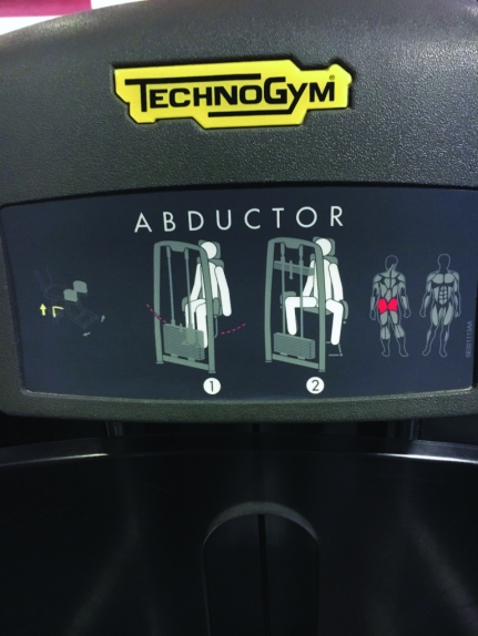
In the gym that I go to the image below shows the only information and signage used to show a user what to do. These are present on all machines and are quite small. In order to see them you have to be quite close and this doesn’t necesserily help new gym members in knowing where a specific machine is. I believe that my idea of an app design and colour coding each of the muscle groups could easily been translated into a set of way finding signs or directions that help news users navigate the gym and make the gym itself more visually interesting.